The logo in black and white
Mark in mint and lime, wordmark in Outfit. The black version belongs on light surfaces, the white one on dark. Both are in the kit as PNG and SVG.


All versions of the logo
Colour, gradient, single colour and greyscale. Light versions sit on a dark background, sage on forest.









The wordmark on its own
For places where the mark is already present: footers, letterheads, lines of text. Seven colours, each on its background.







The mark without the wordmark
For places where the name already appears: avatars, tiles, sender lines.


The mark in greyscale
For black-and-white print, stamps, watermarks and photos with a busy background. Single colour in grey and black, two-tone with arc and wedge in two greys. Where colour is possible, the mark appears in mint and lime.


Favicons
Two versions for browser tabs and bookmarks. What matters is the interface the mark appears in.


The eight apps
One icon per app, in the order of the product.


Outfit, from 100 to 900
Outfit carries the whole website, from body copy to the wordmark. It is published under the SIL Open Font License and may be passed on.
- Weight 100Collaboration from Switzerland
- Weight 200Collaboration from Switzerland
- Weight 300Collaboration from Switzerland
- Weight 400Collaboration from Switzerland
- Weight 500Collaboration from Switzerland
- Weight 600Collaboration from Switzerland
- Weight 700Collaboration from Switzerland
- Weight 800Collaboration from Switzerland
- Weight 900Collaboration from Switzerland
Lime, green, mint and three sages
Lime is the brand colour, green and mint complete it as the core. The three sage tones are accents on light surfaces. Forest is the ink: type and lines on light ground, where the light tones do not carry. The surfaces below build the depth of the interface, from the page to the icon box.
Lime, brand colour
#ccfc75
Buttons, markers, lights
Green
#77f355
Only the middle of the gradient
Mint
#1ae299
Signal, glow on dark
Sage 1
#dfe9c0
Section pill
Sage 2
#c9dfae
Marker and icon box
Sage 3
#b5d2a0
Dots and lines
Forest, type and line
#0f4d38
Type and line on light
Page
#f7f7f7
Content card
#ffffff
Row inside the card
#fafafa
Warm card
#faf8f5
Icon box inside the card
#f2f2f2
Text
#0a0a0a
The surface decides: action is lime, light sections carry sage on a white card, dark surfaces carry the core colours.
The one gradient
Lime, green, mint in this order. Only on a dark background, never across a whole section.
The Collabase AI mark
Arc and wedge as in the Collabase mark, in a colour world of its own. The mark is app icon and loading indicator at once: it shows whether the AI is idle, thinking, searching or done.
The AI colour world
Day for the animated mark and light surfaces, night for dark ones. The AI colours appear only in the AI mark, never as a surface, button or marker.
Day
#1f57f9
#9372ea
#e47eab
#fb8132
Night
#14006e
#6100b0
#af0eba
#ffd3c8
App icon, favicon and mark




































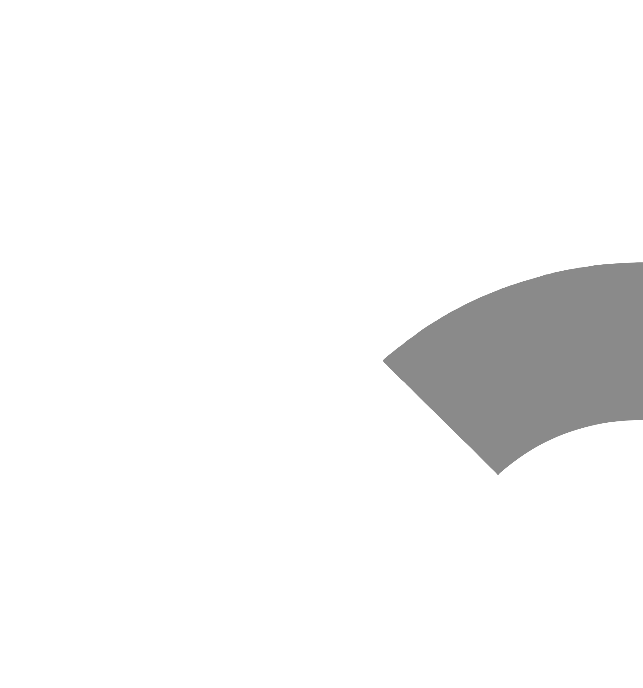
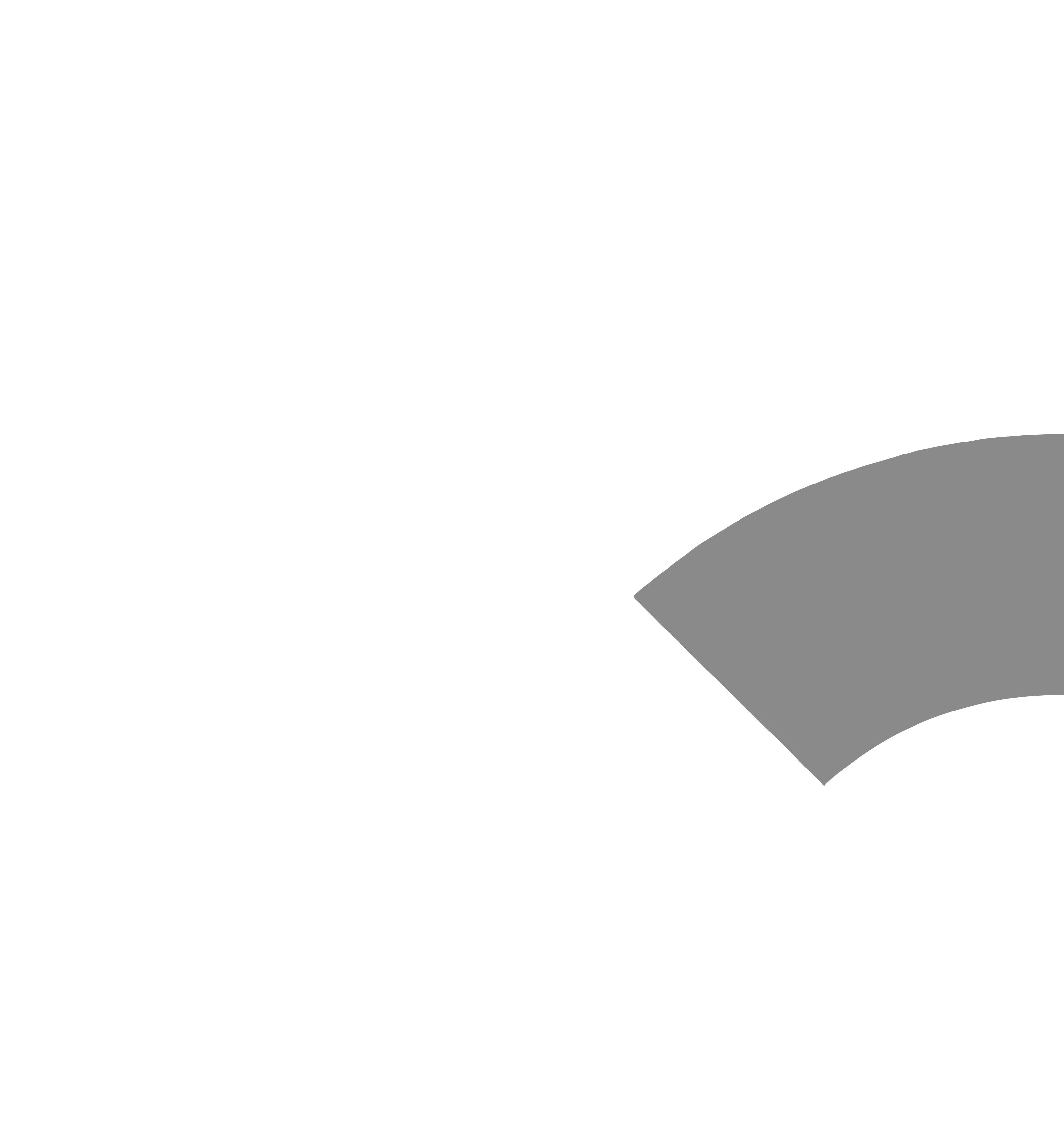
















Never on the same line as the Collabase logo.
No glow below 48 px.
The favicon stays still.
In the product the mark comes from code, never as a GIF.
Collabase is a filed trademark
The word mark Collabase is filed with the Swiss Federal Institute of Intellectual Property. The application is under examination; the register entry is publicly available in Swissreg.
- Mark
- Collabase
- Type
- Word mark
- Status
- Application filed
- Register
- Swissreg, Swiss Federal Institute of Intellectual Property
Spelling
Collabase as one word
Capital C, the rest lower case. Not «CollaBase», not «Colla Base», not in capitals.
App names carry the product name
The apps are called «Collabase Docs», «Collabase Projects» and so on. The product name comes first, the app name never stands alone.
No symbol on the name
Collabase carries no ® on its name. The symbol stands for a registered trademark, and registration is still pending.
Four points
Proportions stay
The files are scaled, never stretched, and keep the clear space they come with.
Colours stay
Mark and wordmark are used in the colours shown here. There is a matching variant for every background.
Contrast decides
On photographs and coloured surfaces, use the variant that stands out clearly.
Open cases we settle
For a use that is not covered here, a short message is enough.